
The fashion industry is built upon the delicate tension between conceptual ambition and sartorial execution. At the recent presentation of A Letter, the design duo of Matt Empringham and Freddy Coomes attempted to navigate this precarious balance, promising a pivot toward accessible, grounded luxury. However, what transpired on the runway served as a sobering case study in the gap between intellectual intent and finished product. Despite a pedigree of previous success, the latest showcase from A Letter struggled to translate its ambitious references into a cohesive reality, leaving critics and attendees questioning the brand’s current trajectory.
The Main Facts: An Ambition Unmet
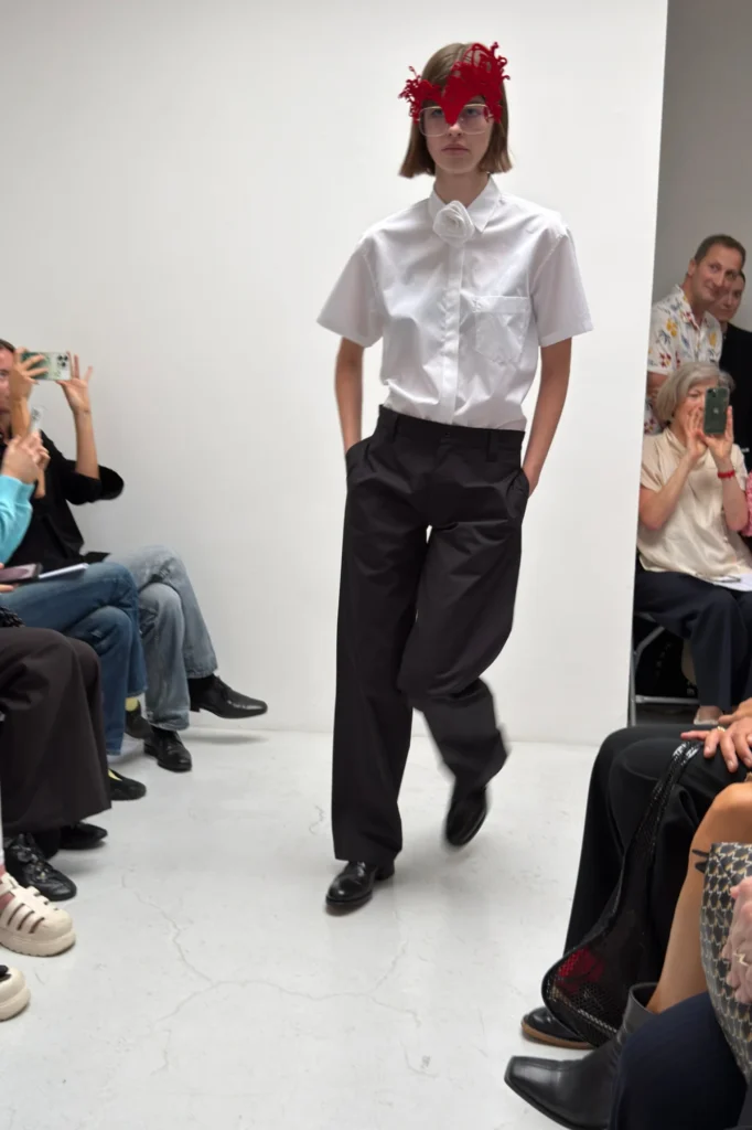
The runway show for A Letter was defined by a sense of austerity, perhaps born of necessity. With a cast of only five models, the designers opted to have each individual walk the circuit twice. While the stated goal was to grant each look maximum airtime, the repetition only served to highlight the limitations of the collection. The garments, which aimed to deconstruct British archetypes, instead appeared caught in a state of perpetual incompletion.
At the heart of the collection was a conceptual reimagining of British staples. The design brief promised a dialogue with the mundane: donkey jackets, vintage men’s chinos, Ben Sherman gingham shirts, and St. Michael’s underwear were cited as the foundational inspirations. These were to be elevated through DIY-adjacent flourishes—zigzag stitches on elastic bands, raw-edged transparent jerseys, and the splicing of calico into silk. Yet, when these elements met the runway, the result was a disjointed assemblage. Slipdresses suffered from ill-defined, boxy silhouettes; necklines sat precariously on the frame; and structural elements, such as pocket linings, appeared not as intentional design choices, but as technical oversights.
A Chronology of the Presentation
The atmosphere leading up to the show was one of quiet anticipation. Following a previous season that was widely praised for its diaphanous charm and ethereal sensibility, expectations were high that Empringham and Coomes would solidify their status as rising stars of the London fashion scene.
As the show commenced, the brevity of the cast became immediately apparent. The first loop of the models established the visual language of the collection: a collage of repurposed fabrics and British working-class aesthetics. However, as the models completed their second circuit, the deficiencies in the garments became impossible to ignore. The "raw-edged" aesthetic, which can often signal a high-fashion, avant-garde ethos, here felt more akin to a lack of finishing.
By the time the final model exited, the audience was left with a sense of dissonance. The show, intended to be a manifesto on wearable, everyday fashion, failed to bridge the gap between the utilitarian roots of the clothing and the high-concept execution attempted by the designers.
Supporting Data: Dissecting the Design Language
To understand where A Letter faltered, one must look closely at the interplay between the designers’ intentions and the physical garments. The designers utilized a palette of textures that, on paper, offered a compelling narrative.
The Deconstruction of the British Wardrobe
The intention to weave the history of St. Michael’s and the ruggedness of the donkey jacket into a contemporary lens is a commendable pursuit. Yet, the technical execution failed to support the weight of these historical references. For instance:
- Structural Integrity: The boxy shapes of the slipdresses lacked the necessary tailoring to give them purpose. Rather than appearing "deconstructed," they appeared ill-fitting.
- The Transparency Paradox: The inclusion of transparent backs, while a common trope in modern runway shows, stood in direct opposition to the brand’s stated goal of creating "grounded" and "wearable" clothing. The lack of interior structure left nothing to the imagination, effectively negating the "everyday" ethos the designers claimed to champion.
- Unfinished Hems: In high fashion, a raw hem is a choice; in this collection, the half-unstitched hems and peeking pocket linings suggested a lack of time or resources, detracting from the perceived value of the pieces.
Official Responses and Creative Vision
Backstage, following the conclusion of the show, Freddy Coomes spoke candidly about the collection’s direction. In an interview, he articulated a desire for the brand to move away from the conceptual abstraction of previous seasons. "We wanted this collection to be more grounded in clothes people can actually wear and enjoy," Coomes stated.
The designers viewed this collection as a "really nice step forward" for the brand. They sought to distance themselves from the diaphanous, fragile aesthetic that defined their previous work, hoping to establish A Letter as a source for reliable, albeit stylized, wardrobe essentials. However, the disconnect between this stated intent and the visual outcome was stark. By attempting to bridge the gap between the "high" fashion of their past and a "low" fashion of everyday staples, they inadvertently stripped the collection of the charm that had previously captivated their audience, without successfully replacing it with the functional reliability they aimed to achieve.
The Implications: What Does This Mean for A Letter?
The reception of this collection carries significant implications for the future of A Letter. In an industry as competitive as fashion, consistency is the bedrock upon which long-term success is built.
The Identity Crisis
A Letter is currently suffering from a crisis of identity. By abandoning the "diaphanous charm" of their last season in favor of a utilitarian approach that they were not yet equipped to execute at a high level, Empringham and Coomes have left their core audience confused. If the goal is to create clothes that people "can actually wear and enjoy," then the technical finish must be impeccable. Currently, the brand is hovering in a "no man’s land"—too conceptual for the mass market and too unrefined for the luxury consumer.
The Financial and Creative Pressure
The use of a five-model cast and the repetitive walking pattern suggests that the designers may be operating under significant resource constraints. Whether this is a symptom of a scaling issue or a stylistic choice, it creates a vulnerability that becomes magnified under the scrutiny of a runway show. For a brand to succeed, it must either lean into its limitations by creating a highly focused, perfectly executed small collection, or it must find the means to deliver a broader, more polished experience.
Looking Ahead: The Path to Redemption
For Empringham and Coomes, the next season will be critical. The industry is generally forgiving of a "miss," provided the designers can demonstrate a clear evolution and an ability to learn from their mistakes. The path to redemption for A Letter lies in:
- Technical Rigor: Ensuring that every seam, hem, and lining serves a purpose. The "DIY" aesthetic must be elevated to an art form rather than appearing as an error.
- Authenticity: If the brand wishes to reference British staples, it must do so with a deeper understanding of the construction of those garments. A gingham shirt or a donkey jacket has a specific weight and history; to reinvent them requires a mastery of tailoring that was, unfortunately, absent in this collection.
- Consistency: The designers must decide if they are the architects of the ethereal or the masters of the everyday. While it is possible to be both, they cannot afford to be neither.
Conclusion
The latest show from A Letter serves as a poignant reminder that intent is not a substitute for execution. While the vision of grounding high fashion in the reality of the British everyday is a worthy, even noble, pursuit, the realization of that vision requires more than just a conceptual framework. It requires the technical discipline to ensure that a garment’s "unfinished" appearance is a deliberate aesthetic statement, not a reflection of a rushed production cycle.
Empringham and Coomes have proven in the past that they possess a unique creative voice. The challenge for them now is to reclaim that voice, refine their technical processes, and deliver a collection that truly honors the sophisticated, wearable vision they claim to hold. Until then, A Letter remains a brand in transition—a label with a story to tell, but one that is still struggling to find the right words.